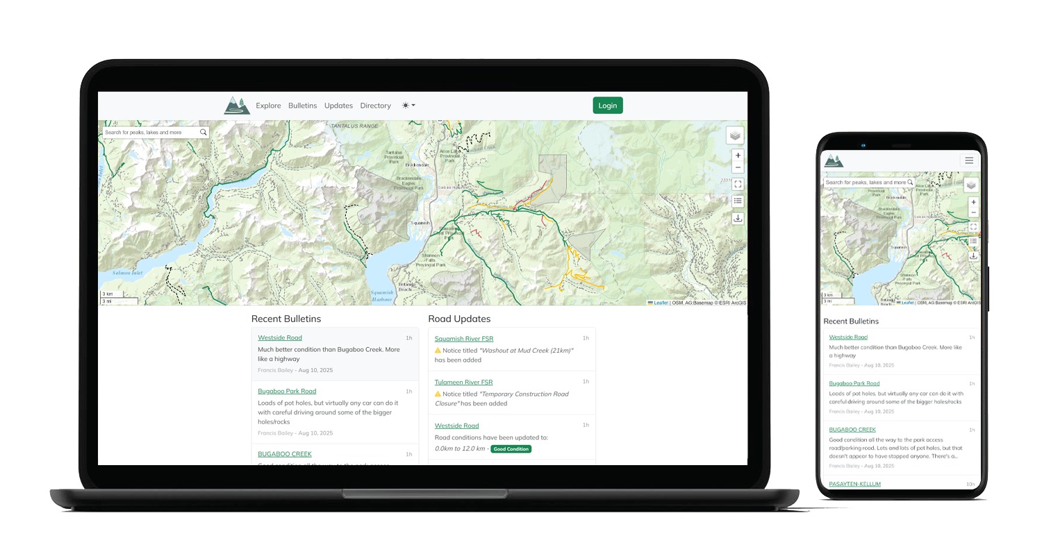
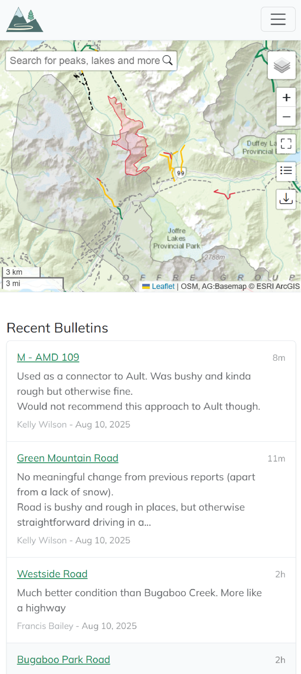
The Service Road Atlas is an ongoing community driven project aiming to provide a free resource for people to access and contribute information on BC & Alberta’s service roads.
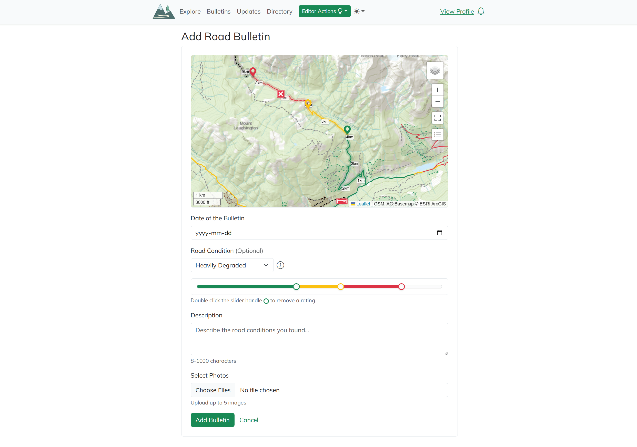
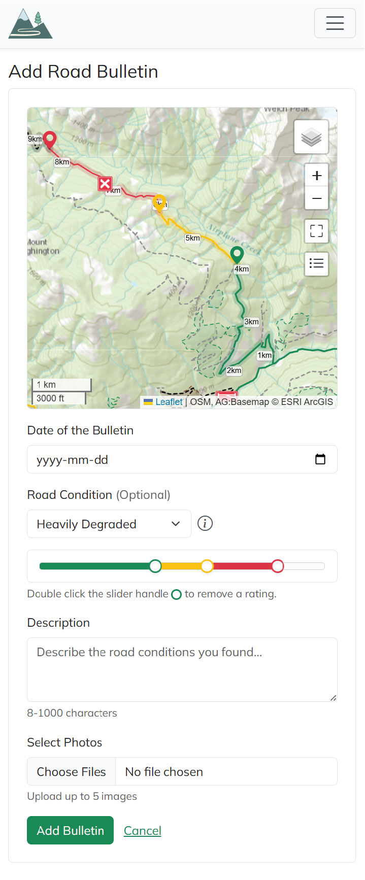
After the site was created, the biggest user-requested feature was the ability to add multiple conditions on a single road. This produced numerous UX challenges, which I will explore in this case study.
Role
User Experience Designer, working directly with a single Developer.
Length of project
2 weeks for this feature, but updates are ongoing!
I’d already completed initial research phases in the process of the website design, so I had a good idea of our target audience and user demographic. I then conducted a survey with a form on the website to collect feedback from users on features they would find helpful, and why.
A large part of my research focused on existing mapping software, and other multi-state sliders and tools. (For example Google, Gaia, Strava, FATMAP…)
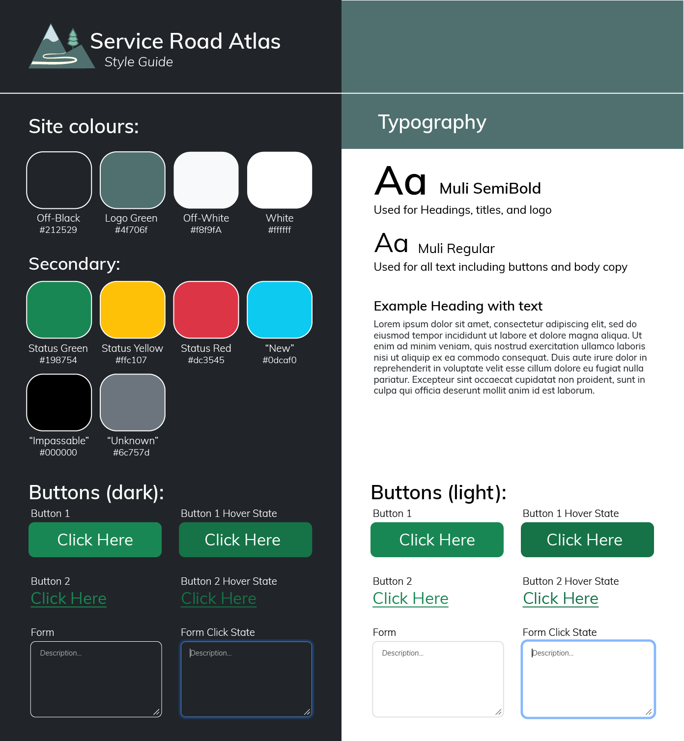
Below is the design guide I had already created:
Style guide
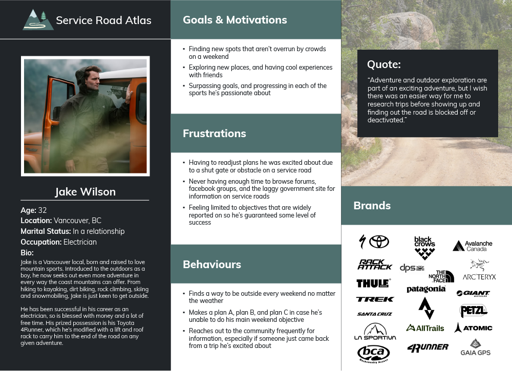
User persona
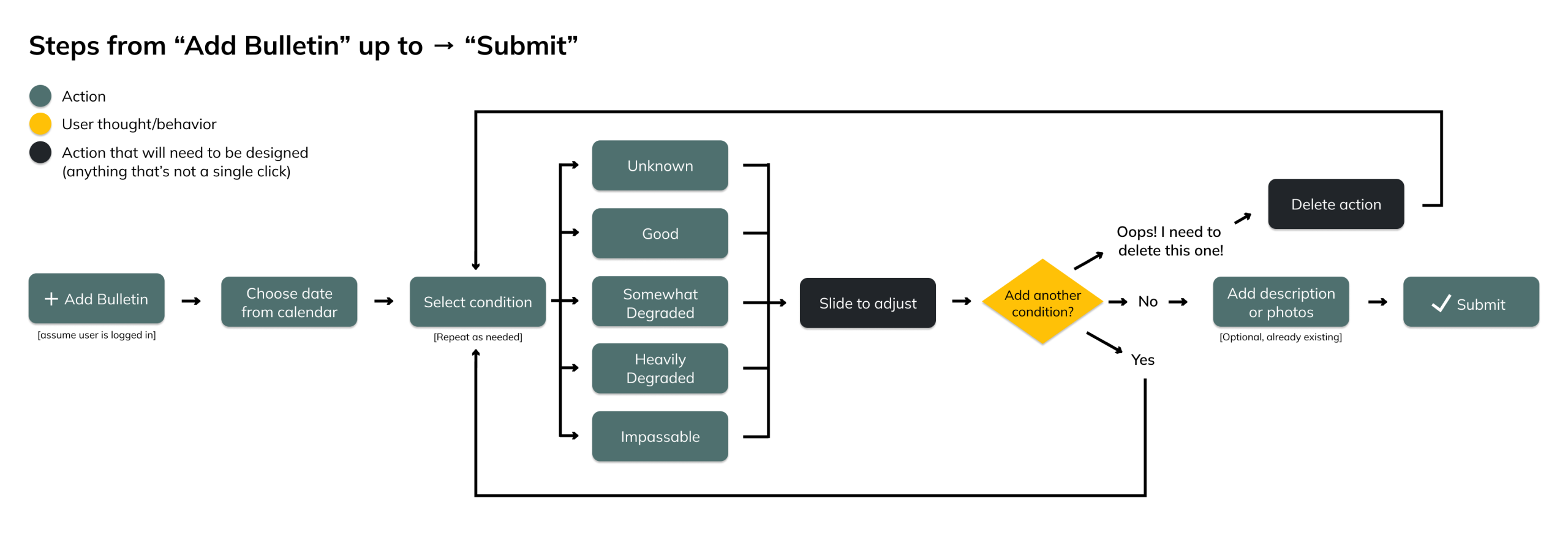
USER FLOW
With intuitive design as a priority, I began focusing on core needs, and working each of them into a straightforward user flow.
User needs:
Adding more than one condition
Ability to change conditions multiple times (ex good -> bad -> good)
Removing conditions if they made a mistake
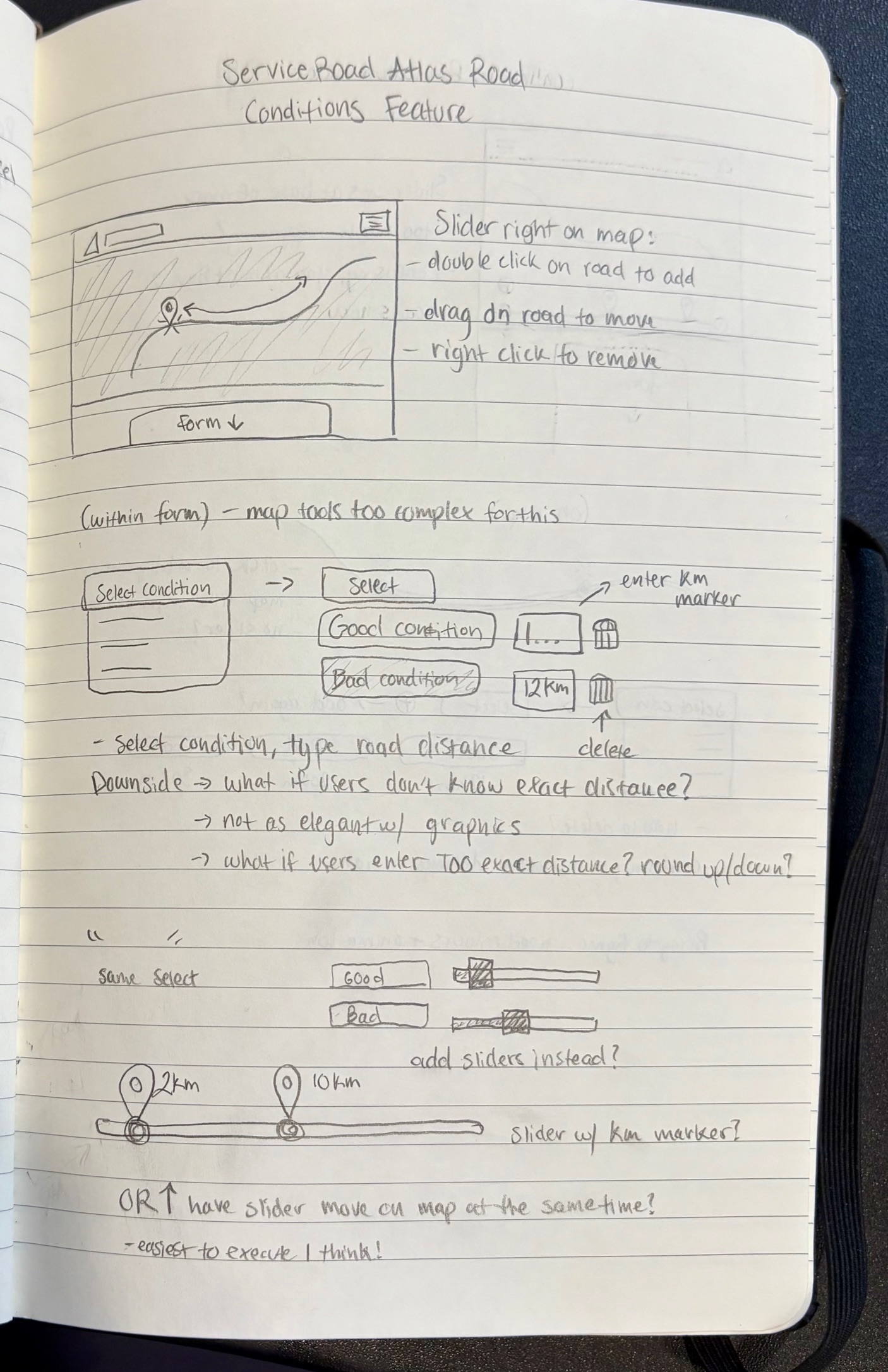
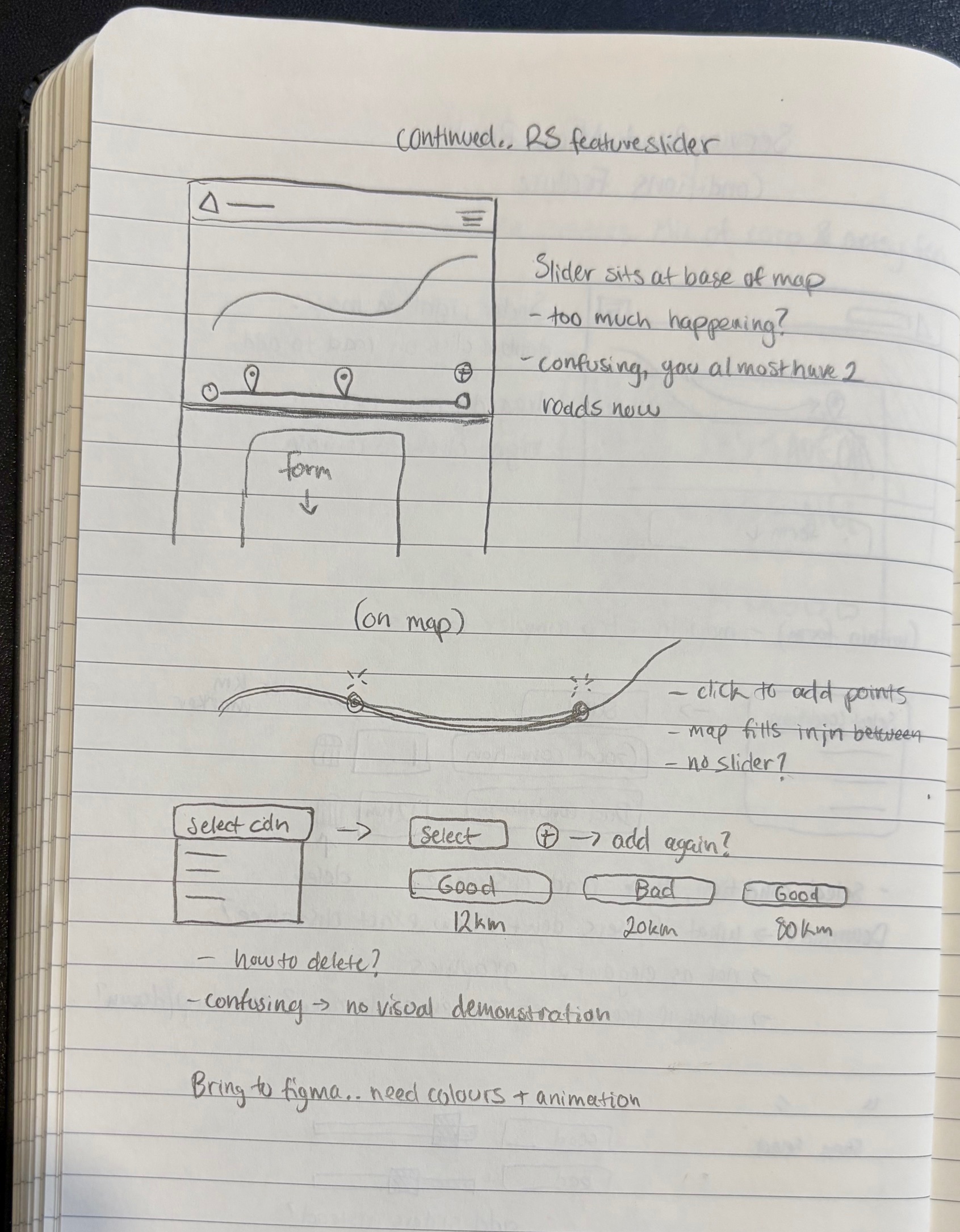
Sketches & Wireframes
I sketched a few ideas down, taking inspiration from the research I’d done with other similar tools.
Once running a few ideas past the developer to determine how easy they’d be to implement, I then began initial designs in Figma.
constraints
Based on developer feedback, some designs would not be possible, so I focused user testing on 2 main ideas that were aesthetically pleasing, and hopefully easy to use.
FIGMA EXPLORATION & TESTING
Using 2 of my more promising sketches, I began laying out designs in figma so they could be tested with users.
I then interviewed 10 users individually, testing one design with 5 users, and the other design with the other half in an A/B approach. This allowed me to compare the overall experience, and gain pros and cons from each version. The feedback from both groups was summarized into working points for the next version.
Main discoveries:
Users want a more intuitive way to remove a status once added
The slider was the most logical way to drag a status along a road
Users were unable to report the exact distance where the road changed, so distances could be rounded down to roughly 500m / 1km
In Version 2, many users wondered what would happen if a slider was dragged backwards over another. Some considerations would need to be added here for usability
Version 2 design tested 80% better on clarity, so this is the direction we went
Development & more testing
I prepared high fidelity designs for the developer for implementation, after which point I conducted some final rounds of user testing, confirming that the feature could be successfully used by anyone.
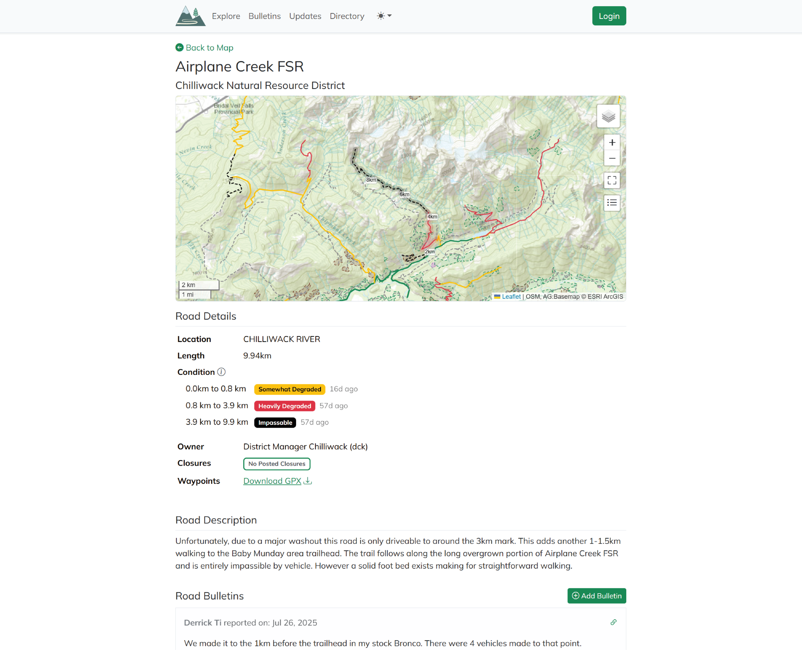
After feature launch and some marketing on facebook groups & forums, we tracked an increase of 15% in new users, and an increase of 10% more road reports, all of which successfully used multi-status road conditions.
Challenges
The biggest obstacle in this project was finding edge cases where users performed unexpected behaviours. Many times when I designed something, user testing would prove that someone expected to be able to click somewhere or perform an action that I hadn’t accounted for.
The solution for this was simply to conduct multiple stages of user testing, allowing users to find “errors” and mistakes at every level. Even now after launch, we continuously accept feedback and bug reports to ensure the experience remains seamless.
There’s a small list of new features to add going forward, users are also requesting a way to report their own road features (impasses, bridges), and gates being open/closed. This will require some extra steps on submitting a road report, although we are looking at ways it could be done separately.
Another highly requested feature is the ability to select which type of vehicle you were driving. For this task, I’ll be making a new icon set, and perhaps adding some radio buttons or something similar on the bottom of the road reports. These will all take some brainstorming!
IMPACT & learning
The great thing about this project is that the more it gets used, the more useful it becomes. As more users join and submit reports, it becomes a more helpful tool for the community.
I’ve really enjoyed working on a project with such a quick feedback loop – users are all quick to reply and happily provide feedback, and the developer I worked with was responsive and quick to provide feedback and implement designs.